Tab menu layout and panels
The tab menu consists of following tabs: Structure, Loads, Finite elements, Analysis, Foundation, Concrete, Steel, Timber, Masonry and Composite. Each tab contains panels which then hold the tools and functions.
Profile and amount of tools
On the right side of the tab menu is a User profile dropbox that contains predefined user interface layouts.
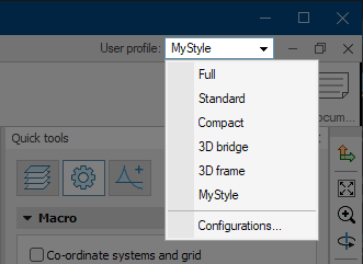
The tabs are always visible, but the amount of tools on each tab depends on the selected user profile layout.
Different profiles hide some tools to simplify the workflow for certain models. Available profiles are:
- Full – makes all the tools visible
- Standard – the factory default standard profile
- Compact – hides some tools for more simple user interface. Good option for easier projects and beginners or students
- 3D frame – shows only the tools normally used for 3D frame structures. Reflects the user interface of a former FEM-Design special module
- 3D bridge – shows only the tools normally used for 3D bridges
- any custom layout - any custom profile you create will appear in this list
- Configuration... – opens a new dialogue window where you can manage the profiles
Customizing your own profile
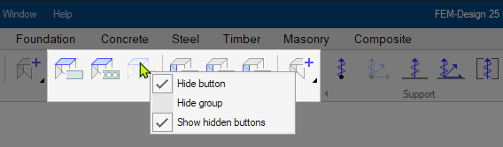
You can right-click on any tool icon in the tab menu to show or hide the tool. The options are:
- Hide button – hides/unhides only the selected tool button
- Hide group – hides/unhides the entire tool group (panel section) that contains the selected button
- Show hidden buttons – shows/hides the hidden tools and groups. The hidden tools and groups are shown with light grey color
Configuration
In the Configuration... dialogue, you can save your customized interface as a new profile with a chosen name, or delete existing ones.

Your saved profile will appear in the User profile dropbox along with the predefined profiles.
You can always switch between the profiles or work with the Full profile in any project.
Panels
Tools and functions are grouped together on panels for easier navigation. Panels can be hidden or visible depending on the profile that is selected in User profile dropbox.
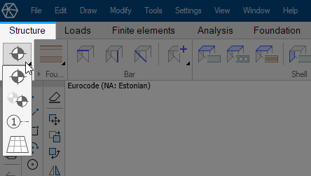
Panel arrows
Some panels are expandable and collapsible. For these panels, there is an arrow to the left of the panel name.
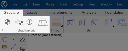
Here is an example with Structure grid panel in Structure tab:
If you press the arrow on the bottom left, then the panel will collapse into a single icon:
The collapsed panel can be temporarily expanded by hovering over it with mouse cursor:
All the tools are available in both states, but collapsed panel takes less space on screen.
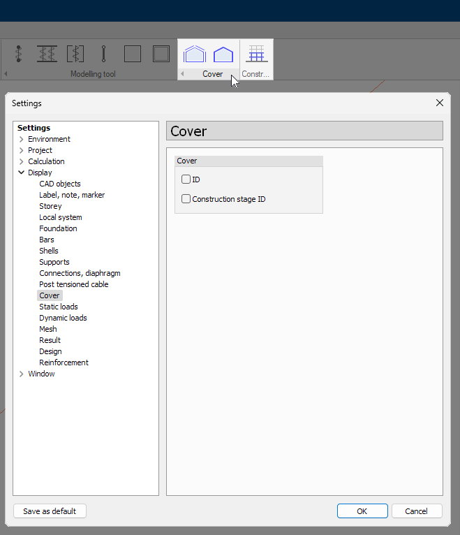
Clickable panel names
Some panels have interactive clickable names. Clicking these names will take you to the relevant settings in the Settings menu. Clickable panel names have dark highlight background when hovering over them with mouse cursor, so they are easily recognizable.
Here is an example with Cover panel. When hovering over the panel name, the background of the name turns darker identifying that it is interactive. Clicking on the name or the background now will open the settings menu for Cover:
The panel Construction stages just right of the Cover panel is not interactive - you cannot click on the name of the panel, since it does not have any settings associated with it.